
How to Create Custom Charts of Your Transactions
StatementOrganizer Team · July 5, 2026
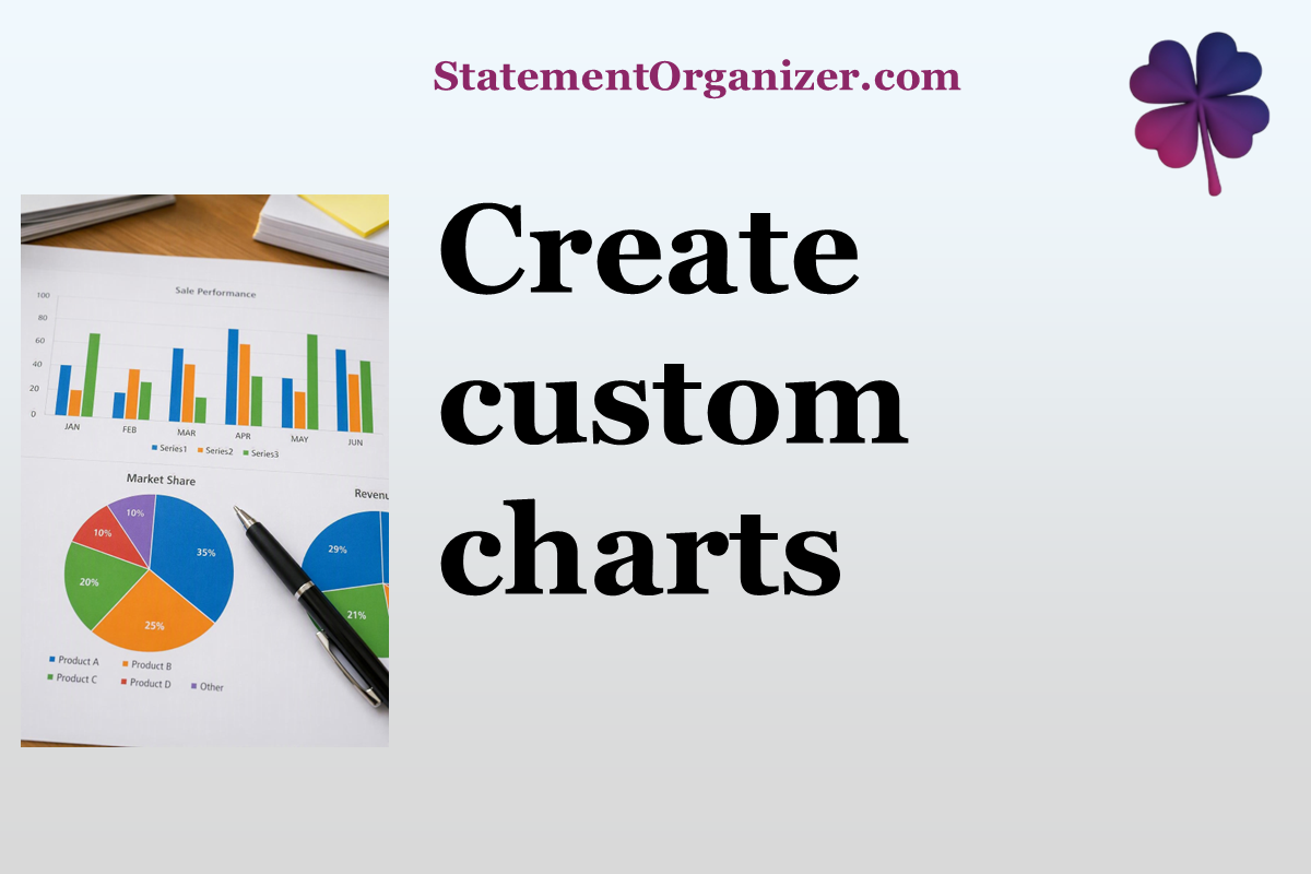
Numbers in a table only tell you so much — sometimes you need to see your spending to really understand it. That's exactly what the Charts section on StatementOrganizer is for.
How to build a custom chart:
- Open Charts from the menu at statementorganizer.com.
- Apply filters to focus on exactly what you want to visualize — search by description, choose one or more categories, select specific entities, or pick a date range.
- Watch your chart update instantly, showing your filtered transactions in a clear visual format.
- Adjust filters as needed — comparing two categories, a specific account, or a custom time period is just a few clicks away.
Charts are great for spotting things that are hard to see in a plain list — like a category that spikes seasonally, or how your spending compares month over month. Because the data comes straight from your parsed statements, there's no manual chart-building involved.
You can combine multiple filters at once, such as viewing just travel and dining spend together across a specific account, all in the same visual. When you want to start over, a single reset icon clears everything instantly.
Whether you're a visual thinker or just want a quick gut-check on your spending, Charts turns your raw statement data into something genuinely easy to read.
Explore your own Charts on StatementOrganizer today.
Comments (0)
Sign in to join the discussion.